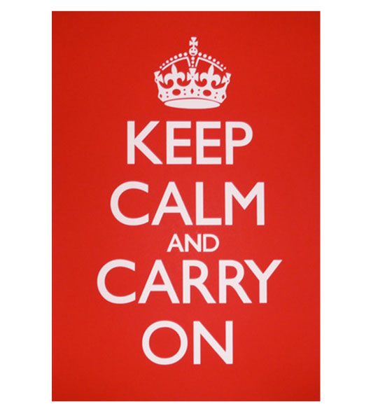
These past couple months i have seen posters with the words “keep calm and” then fill in the blank. These were simplistic posters in a one color layout and always with a crown at the top. Very simple, usually encouraging and to the point. After some research i found the story of how they began which made me appreciate the poster concepts more. Watch the video below.
(Not only was that video put together very well but the bookstore had a great story and was even in an old train station. I must say that’s pretty awesome!)
This poster started becoming a trend even on Pineterest. Here is a link to the board of posters compiled by a user. There are many posters out there that are not done well and in my eyes are just a bad use of the concept and history behind the poster. Many companies have been using this concept and pushing the sales of the design aspect, here is a site called keepcalmgallery which uses the style and i believe keeps the history and respect with it.
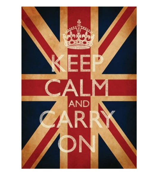
Here is the original layout of the poster and then a minor styled one which i think looks great also.
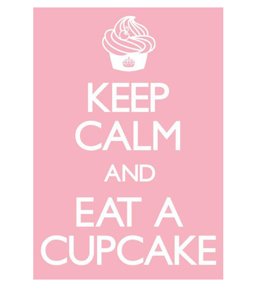
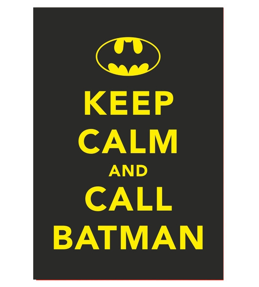
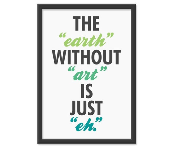
Here are examples of this cultures version of this design.

